We were looking for houses that would serve us for the next 3-4 years and when I saw this one I immediately fell in love with the exterior and could see it had huge potential.
It was cute and importantly close to the train station into Central London and I just knew that I could turn it into a beautiful home given half the chance. So needless to say I managed to persuade my husband that this was the right house for us and after securing it I then had the huge task on my hands to prove I was right and turn it from the ugly duckling on the street to the beautiful swan.
As you approach the house you are immediately taken aback at the beauty of it. The exterior of the house has a real New England clapperboard style look about it, painted white with grey shutters and is sat on a shingle drive with an established wisteria growing over the porch, that ages the property perfectly. It has a beautiful open wooden porch with a lovely front door that has a curved architectural feature with two window nooks either side to flood the hallway with natural light.
Sadly, that was where the beauty stopped and although the bones of the house were lovely it needed a lot of imagination and attention to make it work properly and for us. It had lots of poorly connected rooms and it was painted haphazardly throughout in magnolia and it also had a particularly unattractive orange coloured wooden floor. The light pendants were wrongly placed, alongside curtains and blinds that were utterly wrong in every way. We didn’t want to spend a fortune in updating the space so we had to be clever where we spent our money. As the house had many rooms none of which seemed to have a real purpose we started working on zoning the house for how we would be using it. The first thing I desperately needed to tackle was the wooden floor. It was stained an orange coloured varnish which had been chipped scratched and damaged over the years and I know would have cost a fortune to sand down properly and revarnish. So, we opted to go with the New England feel of the house and paint them which hugely complemented the light airy feel I was going for. We decided the smallest and darkest room at the back would become the family snug/tv room, the largest of the living rooms would become the drawing room, a playroom off the kitchen for our son and what was previously an office with separate back door access became our large boot room with bespoke carpentry as we have a dog and it was ideal for dumping boots and coats etc after long muddy dog walks.
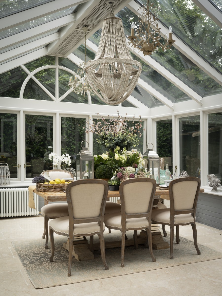
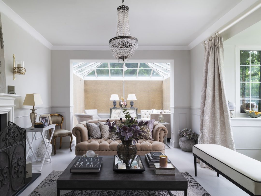
Added to the back of the house there is a beautiful large wooden conservatory off the kitchen that was basically a graveyard for flies and spiders and didn’t have any form of heating which naturally wiped out using this room in the winter. This wasn’t ideal for us as we wanted to turn it into our large dining area for when we entertain. So this room had a total overhaul. We added three high output beautiful traditional style column radiators in there with brass valves so we could use it all year round and then replaced the floor with a tumbled pitted marble. We then repainting the brick and woodwork in Zoffany colours and it made the whole room come to life. It looks so good now that we have renamed it ‘The Orangery’. And I’m particularly pleased that it has become the perfect home for my treasured oversized urns. A rather grand Andrew Martin wooden table with silver legs takes centre stage.
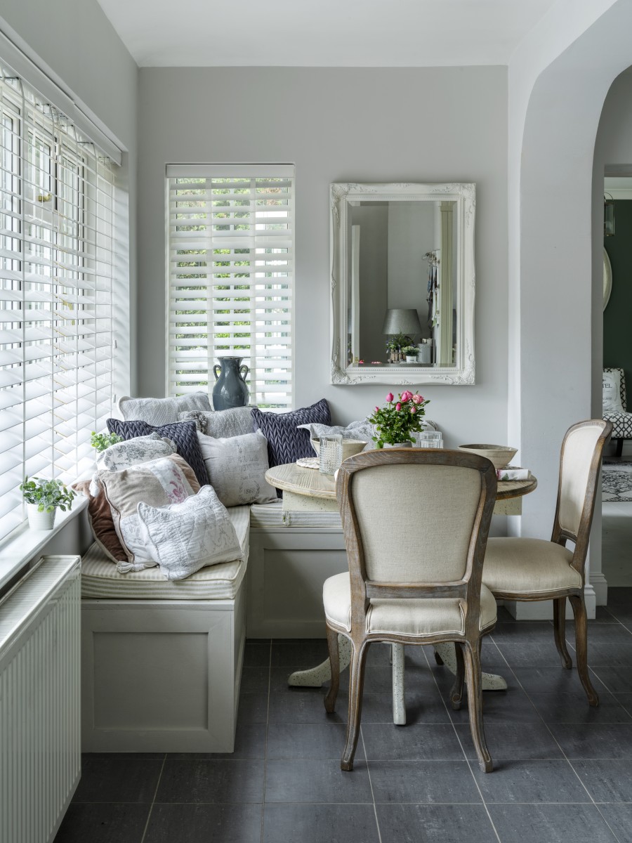
Although the kitchen wa lovely it could very easily have become a walkthrough with only a small amount of space in the corner for a table. I quickly realised that a table with space for chairs either side may eat into the space too much to be workable so we came up with the concept of a window seat with upholstered seat pads and cushions could be a great way of saving space and look very in keeping with The New England style of the house. It also gave it the air of a relaxed quintessential kitchen table flooded with sunlight that invites you to sit and read the papers over a long breakfast. We then painted this seat the same colour as some of the floors downstairs and the same colour as the woodwork in the boot room and drawing room. It has worked beautifully in creating a through line as you walk from room to room. We also added three glass pendants above the island and added in three white New England style stools to the island with gorgeous linen seat pads.
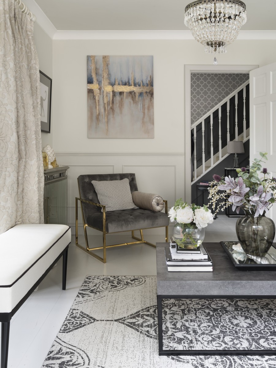
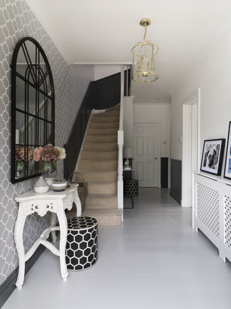
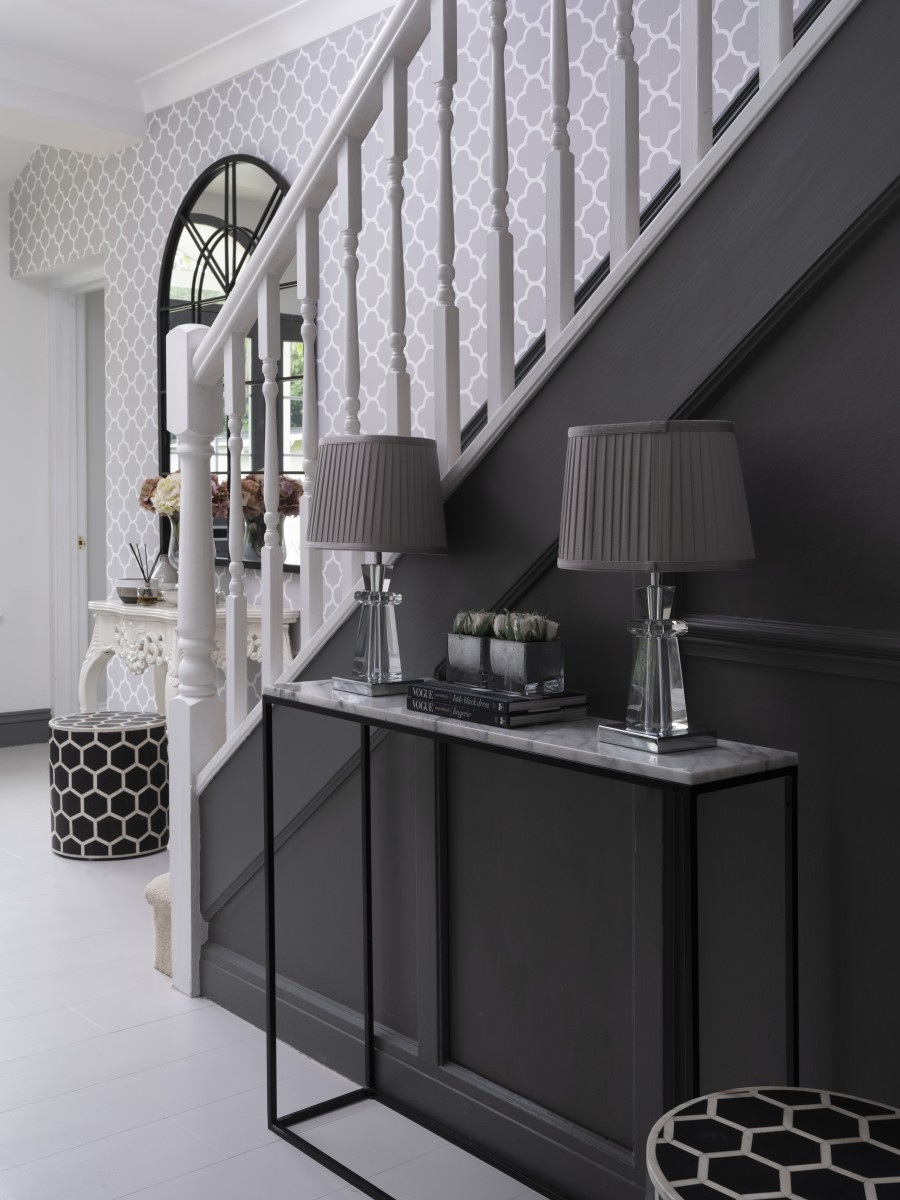
From there we changed two gas fires back to real logs and we also decided to add base wall panelling to the hallways and drawing rooms to make those areas more formal. It just finishes these areas so effortlessly. Because of this we kept the rest of the walls very bare in the drawing room and it’s the perfect harmony and balance. We will be adding more artwork as we find it so it will be ever evolving. I don’t think this part is something we should necessarily rush to purchase and always worth waiting for the right piece.
The snug was the smallest and darkest room in the house so we used this and painted it black and it is so cosy and inviting after a long day’s work with an L-shaped sofa perfectly placed and draped in fur throws and textured cushions. Its a black and white take on an alpine style nest and is my favourite room in the house. I had to add a bit of glamour with strategically placed chrome frame tables and rose gold hints that bounce back from the back walls, alongside vintage posters and brass wall lamps for a timeless elegance.
My son’s large playroom off the kitchen was just all about having fun with the design. I wanted something that was cute as he was still little but it could grow with him so I opted for a rabbit theme wallpaper on just one wall but was counterbalanced by a strong and more mature compliment. Because of the nature of playrooms being filled with many contrasting bright colours I wanted to tone down the walls so I painted the remaining three walls a dark grey. I then complimented this by a softer neutral white and grey elephant fabric for the blinds. This ran parallel to the rabbit wall, so it balanced the room perfectly and helped to soften the dark grey and tie they whole room together. And then for fun I added throw and cushions with rabbit tail Pom poms, I added small pom poms to the bottom of the blinds, had a matching throw in style to the blinds too draped on the sofa and finished it with many cushions. With a strategically placed rug and beautifully looking child sized wooden and upholstered furniture the space was complete and fit for a little king. We even added his name in bold white on the grey wall to personalise the room to him.
For the upstairs, we didn’t need to do nearly as much. The biggest transformation was definitely my sons room. I wanted to create a space that was calming, inducive of sleep and not filled with many toys or bright colours. I wanted to make it feel like a boys room but I wanted that to come across more in the accessories fabric and wall art as opposed to the colour of the walls. So I painted the walls a beautiful Farrow & Ball calm and warm grey with beige undertones. I opted for cream and wood furniture. Again a calm option and then accessorised this with bespoke blue, beige and stars bunting, perfectly picked fabrics, alongside bespoke cushions and blinds. I doubled up on the blinds because the room was very light and I also adore the look of two fabrics coming together to bring more depth to the windows.
When choosing my sons bed I wanted something big enough that I could snuggle in with him if needed, something that wouldn’t hurt if he fell out of, something that he loved and also something that would enhance the space as opposed to overpowering. I found the perfect raw wood bed frame style house that is barely off the floor and allowed me to adorn with bunting. Because it is so thin you almost see through it so it also helped to make the space feel even larger that it was. To finish off the bedroom we added a fabric teepee for den bedtime reading and used a complimentary fabric inside the french style wardrobe to match alongside some fabric art pieces that tie in the whole room perfectly.
When we moved in there was a strange office space area/room just before you entered the master bedroom and ensuite bathroom, which we have turned into a wonderful walk in dressing room with lots of shoe and bag storage, every women’s dream. By adding in new wardrobe doors and a re paint, new curtains and lighting through the upstairs area took on a much more luxurious and bespoke feel.
I wanted to create a striking feature in the master bedroom so I decided to make a floor to ceiling high headboard with a contemporary pattern to draw the eye up and give the bedroom that boutique hotel style look. Made of taupe coloured silk, it is also wonderfully comfortable for reading up against at night. A pair of oversize bedside lights fill the space and create the hotel chic look. We didn’t have to do anything to the bathroom as the centre stage bath is a timeless design and the grey slate tiles off set the white sanitary ware perfectly so it’s a great place to have a bath at the end of the day.
We didn’t spend a fortune but we have definitely achieved what we have set out to do.
www.carladesigns.com