I usually talk about many of the elements that are an important part of the creative process when designing interiors: flooring, lights, bedding, art, sofas, wallpaper, finishes and about inspiration, among others.I thought it would be good to share with you, my readers, how I applied some of those concepts and ideas in a specific project, so you can see what part the played in the process and how the outcome was influenced by them. Let’s have a glance at the different key elements: the client, his brief, the proposal and the outcome.
The Client
Josh, a very successful young businessman and entrepreneur, bought this one bedroom flat in a contemporary block of apartments in the Dalston area, with a desire for a home that expresses his life style: dynamic, informal and incorporating elements of his background not just in terms of his hobby and interests but those of his favourite period. Diego Correa Interior Design was given the task of putting all these pieces together, choosing the finishes, the furniture layout, the lighting, free standing and bespoke furniture, and soft furnishings to create a flat that is full of individuality and captures the client’s essence and character: a masculine but relaxed environment where he can feel comfortable either on his own or when entertaining guests.
The Brief
In our first meeting to discuss the brief, Josh gave me very precise information about what he wanted, not just in terms of visual reference but how he wanted to enjoy the space:
Feel: Masculine. He likes dark colours and wallpaper.
Visual References: TV American series: Mad Men and Californication; The Thomas Crown affair, 69’s movie and Rock and roll, Jim Morrison
Functionality: The social aspect is important as he plans to invite friends regularly for parties; storage space as he does not like clutter; He plays guitar so an area for this activity is very important; a very comfortable sofa and a wall mounted unit for the TV. Modern look; table for terrace and lighting, wall mounted heaters; for his bedroom he wants a big wardrobe; bathroom: additional storage space and change colour scheme; bicycle to be hung in the hallway and improve lighting.
Pieces he is bringing from his previous home: bed and guitar
Proposal
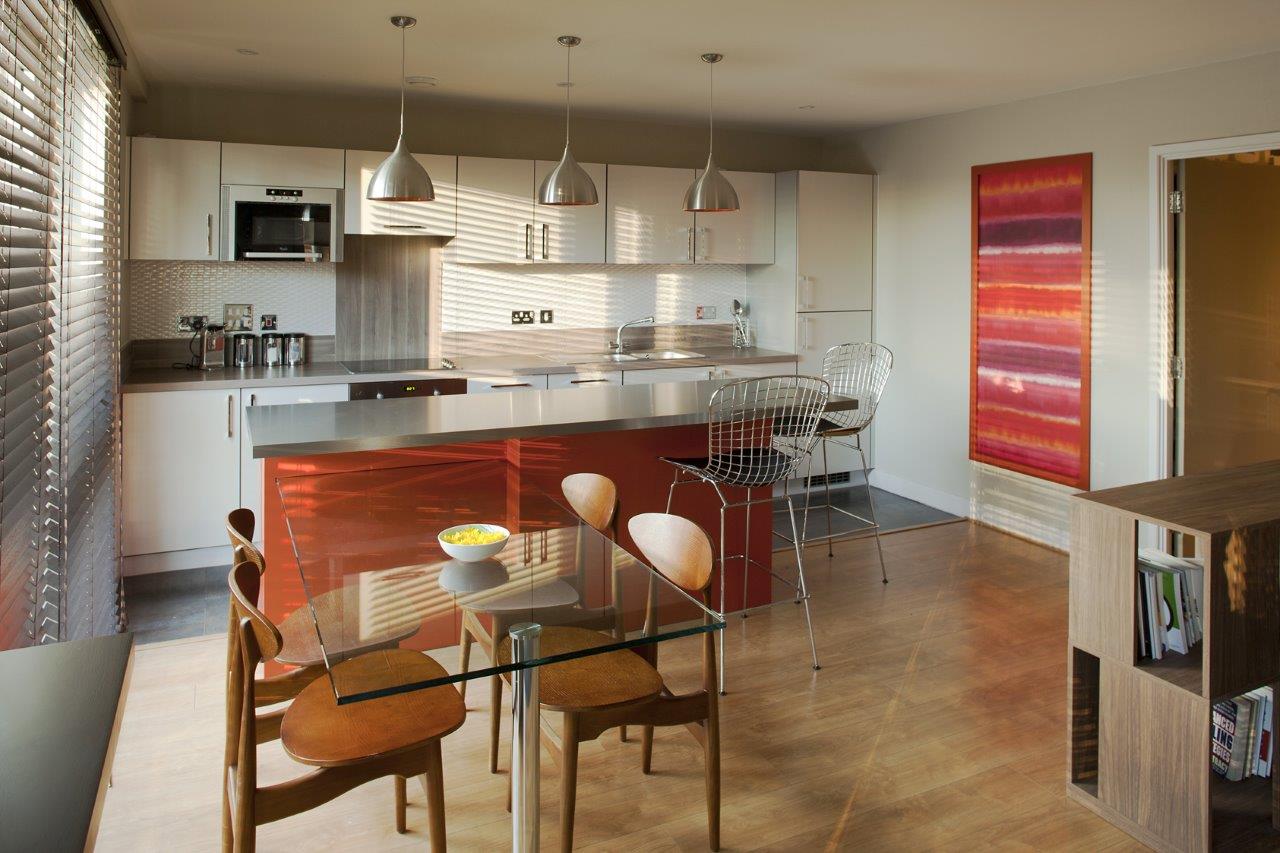
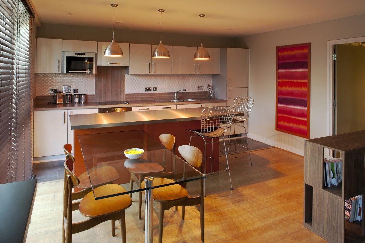
There were certain elements I had a clear idea of when I started to develop the concept. I would not use white and the furniture layout was extremely important as in the living area I had to create 4 areas that were visually/spatially connected but independent of each other: kitchen, dining room, living area and guitar area.
I had to integrate certain retro elements from the 50s and 60’s but did not want that to be overdone. So I kept them to a minimum using arm chairs and colour.
The furniture layout was organized taking the flat’s floor plan into consideration: the living area around the TV point; the guitar area in the space between the long balcony and terrace, which additionally offered an ideal location for entertaining guests.
I suggested having an island as the element that would connect the kitchen with the living room. This would increase the amount of storage space and the dining table would be attached to it. The material I chose for the dining table surface was glass in order to give a lighter, more modern style.
Another decision that was taken with the client, even before developing the concept, was to use venetian blinds in dark wood to create a practical and masculine ambiance.
All these elements came to me at once. Next came the colour, which was going to play a key role in the creation of the atmosphere of the flat.
I wanted to use a very strong wallpaper in the hallway since first, the area is of a good size, and second, I wanted it to be so bold that, in contrast, the colour scheme of the open plan area, although dark, would be perceived as a lighter and warmer.
I visited some wallpaper suppliers and when I saw the Harlequin design it gave me the key for the entire colour scheme: cappuccino and grey shades. This is how I connected the hallway with the open plan area and also with the bathroom. I proposed to change the bathroom tiles which were too light, to a shade that matched the hues in the wallpaper.
I proposed then to also change the kitchen tiles for darker ones. The long kitchen did not have a splash back so I proposed the addition of a white textured tile in order to give a lighter focal point. The texture is reminiscence of retro tiles.
Coming back to the hallway, initially we were going to have Josh’s bike there, as a feature on the long wall, but due to practical issues we decided not to do that. Instead I proposed that 2 Chinese prints should be hung there as a way of reducing the intensity of the wallpaper pattern while at the same time adding an elegant feature. A console and stool were placed opposite them. I chose a modern linear piece of furniture in walnut to help balance the feel of the space.
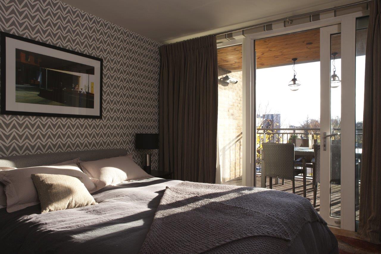
For his bedroom I wanted to use dark wood and grey, picking up the grey of the wallpaper in the hallway. Because Josh likes 50s and 60’s features I chose a geometric pattern wallpaper for the wall where the bed was going to be. I did not want to use it all around the bedroom so I chose a striped wall paper in grey, white and cappuccino for the other walls to achieve connection with the other wallpaper. The curtain was to play an important role as it needed to connect both wallpapers. I chose a striped fabric in dark reds and toasted cappuccino. The multicolour rug brought life into the bedroom. Bedside tables were chosen in walnut, table lamps in grey, and shades in black. On the wall opposite the bed, a floating shelf was installed. The shelf and wardrobe doors are in the same finish. Above the bed, a print of a Hopper painting was chosen.
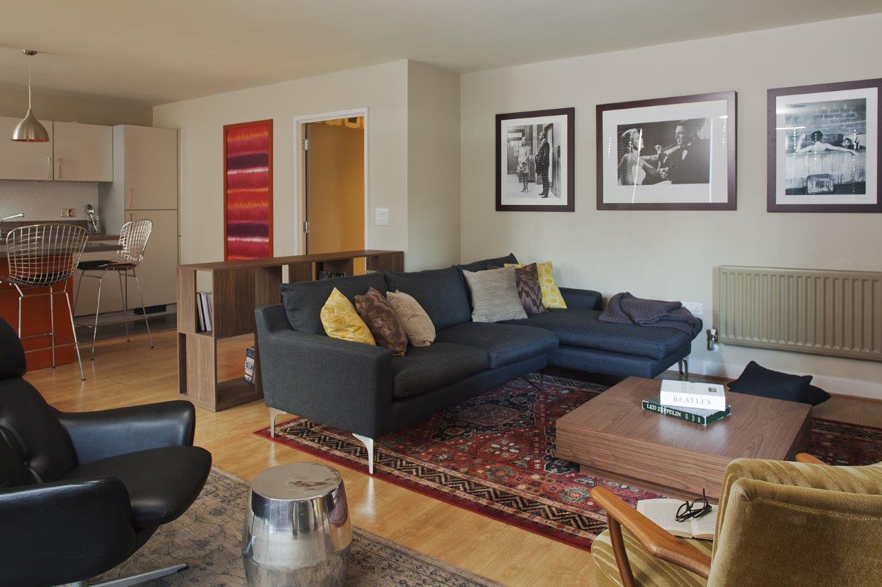
For the living room I chose an L shape sofa in grey as I did not want to use too many colours. The client had mentioned he wanted a red Persian rug so I incorporated that into the living area. A vintage armchair in a yellowish-green colour complemented the composition with the sofa. A coffee table in walnut matched the other pieces. The TV unit was chosen in dark wood, matching that of the blinds. For the guitar area, I proposed a modern version of a Persian rug in grey in order to create a connection in colour with the sofa and in style with the rug.
On the rug I proposed that we placed a retro armchair in black leather where Josh could read or practise guitar. Beside it I placed a side table to give a contemporary touch.
On the wall the client wanted to use photography from movies of the period. A dark wood frame was chosen to coordinate with the colour scheme. The cushions on the sofa were connected in colour but not fully matching since I wanted a loose, relaxed masculine approach.
Now that I had chosen the entire colour scheme, I had to decide the finishes and colour for the island unit. I proposed a lacquer unit in a dark orange in order to bring life into the kitchen and because it is a colour that is usually associated with retro features. A colourful wallpaper was used as a feature frame complementing the retro look, plus 3 pendant lights in silver and orange. The Island’s worktop was proposed in a plastic laminate, stainless steel finish.
For the terrace, a table and chairs in a fusil fibre colour were proposed with 2 pendant globe lights above it in black, retro style. To add a contemporary detail, 2 rows of LED lights were added on the deck, on the long sides of the terrace.
The lighting follows the same concept as the furniture layout. LED downlights were used in the hallway, bedroom and open plan area.
In the bathroom, the colour for the walls was a darker hue of than that of the floor tiles. Above the long side of the bath, a lighter tile was chosen, in the same design. A wall mounted unit for storage was proposed, similar in colour to the vanity unit, and accessories were suggested.
Each Project demands a personal approach, my aim is to capture the way the client wants to live his/her/their life and translate that in beautiful surroundings that inspire them and ultimately give them happiness.
Diego Correa
www.diegocorreainteriordesign.com
Photography: Enzo Mercedes