The design brief was to give some youth and energy to a beautiful and well proportioned, but rather serious house. Arriving at the front door of the flat fronted, Georgian façade, you have a pre-conception of what will be inside. I wanted to play with these expectations and subvert them totally.
As colour is always my starting point, I set off to change the mood with some unexpected exciting colours. I always like to have a unifying colour either subtly or boldly iterated through a house or project, and in this case I used blues. The constant colour use creates a visual link through the property that people respond to, often subconsciously. It makes the home hang together.
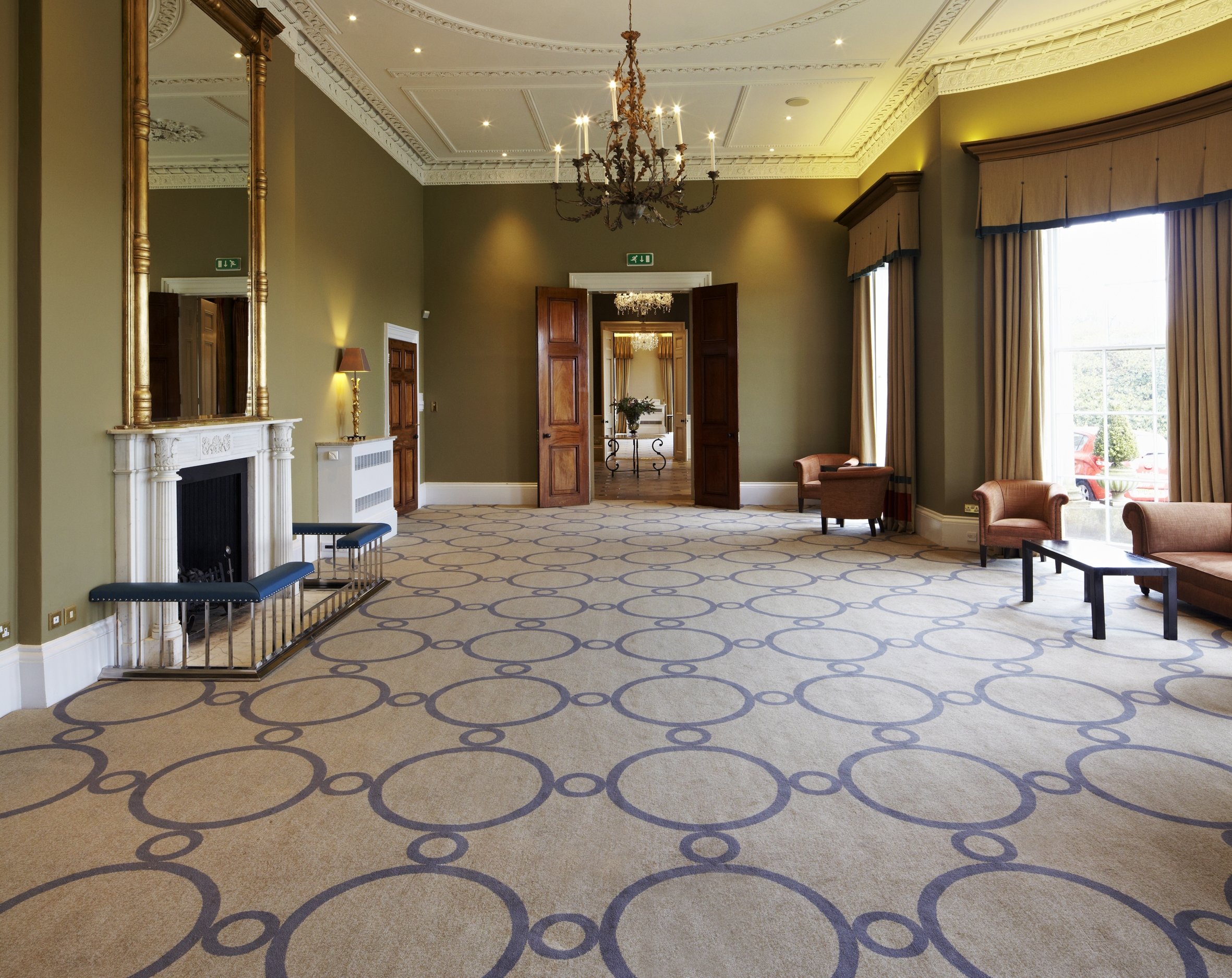
You enter (the hallway) into quite a grand and classic space, which is made rich and strange by the high impact geometric wallpaper on the left wall in jewel tones. There is also a fuchsia-pink lacquered cabinet ahead of you and a pair of bespoke faux shagreen and velvet armchairs to the left. These items in particular create the mood, and inform the viewer that this will not be a regular taupe townhouse.
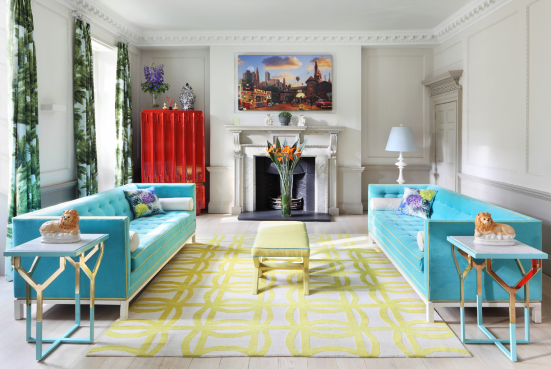
The drawing room, which only receives direct sunlight for around two hours a day in the afternoon, I wanted to make sunnier with the use of yellow, and I combined it with turquoise, one of my favourite colours. I also brought in some graphic and geometric patterns for additional impact and to give the room a more contemporary feel. That combined with various textures and hard surfaces – velvet, wool, wood, lacquer, brass and marble – give the room diversity and lift. I love architectural history and this house has historical detail in abundance, so it is lovely to play these games of combining our own time with the craftsmanship and detail of the past.
Blues are the most calming of colours so it is a great choice for a bedroom where you want people’s state to be relaxed. The only thing to guard against is making the room too cold, as blues are cool tones, so warm counterparts should be used. In this huge first floor master bedroom, I added oversized white ceramic lamps with large-scale yellow lampshades. These tie in with the vibrant yellow in the fireplace painting. Yellow and blue are a wonderful colour mix, reminiscent of sky and sun. Yellow warms the blue and provides a burst of energy. It is an infectiously happy colour. Colour psychology says that yellow can make some people edgy or even aggressive. Personally I have never seen this and can scarcely imagine it when it buoys up my mood so instantly, but it is something to be aware of, and should perhaps be used with caution in a nursery! Other than the yellow though this is the most monochrome room in the house. There are soft accent colours too but on the whole the room plays around a relaxing interaction of various layered blues.
The master bedroom, like many of my designs is quite pattern heavy. My way with pattern, as in fact with colour, is gut instinct. I don’t follow any specific rules but using different scales of pattern helps. Although the pattern on the wallpaper and rug is different, they both loosely mimic shapes in the ceiling plasterwork, and actually the sculpted silhouette of the headboard is a pretty close match too. It is also good to use lots of block colour, for example on the bed, sofa and curtains, which has a balancing effect on the pattern. Don’t forget that photographs are deceptive. When you stand in the room, your eye is drawn to the rug, or the wall or ceiling, you would rarely be able take in all three patterns at once.
People often think that space needs to be filled, but negative space (if you have enough square footage for it!) can be very luxurious. The blue and cream rug by Martin Lawrence Bullard is so beautiful with its blue singing silk that I wanted to allow it its own floor space, as you would give a painting its own wall space. It has become one of the main focal points of the room. Keeping the rug clear of furniture also makes the bedroom feel even more expansive and spacious. This room also has 11 foot high ceilings and the amazing original plasterwork on the ceiling dates back to the 1750s.
The adjoining master bathroom and closet, is as large as the master bedroom so it was a great space to work with. I wanted to keep it very open and airy. One thing to remember with a bathroom is that just because it is a functional space does not mean it has to be devoid of character. Here a shabby chic Georgian chair gives this room an instant sense of comfort. Good lighting is crucial too, so always make sure you have well lit mirrors, preferably lit from both left and right, and sufficient ceiling lighting. Go for a chandelier to give the room some glam! I also always like to include fabric or a wallpaper as it warms the whole room up and gives texture, but you have to be sure your ventilation is good for this; although there are some great water resistant examples of each now available. Or use an outdoor rug as an oversized bath mat. Outdoor rugs can be brilliantly affordable and come in some great geometric designs and colours. These ideas can all transform your bathroom into something with real warmth and personality. This is key given we often spend the first 20 minutes of every day in our bathroom so it is important that you enjoy being in there and that it lifts your spirits to set you off on your day happy.
Two further guest bedrooms and ensuite bathrooms are on the next floor up. These are slightly bolder and more vibrant than the Master suite as they are for more occasional use. In both I used a feature wallpaper. I am a huge fan of wallpaper, and love it wall to wall but I still find using it for a feature wall really effective. It is also a much cheaper way of using it if you are budget conscious. It will usually require that you balance out the other walls in some way. But generally a strong piece of art, some fabric at the window, or a brightly painted door can do this work for you.
In both rooms I had the identical teal lacquered bookcases made. Partly because I think they look brilliant, but it also goes back to this idea of creating iterations and cross-references throughout the house. Both wallpapers are Cole & Son, who have an incredible collection with many thousands in archives, but have produced some brilliant contemporary papers too. The bright pink cowslip is feminine but the black background grounds it back down. I generally prefer to create gender balanced rooms. Though my design probably usually weighs towards the feminine, I prefer not to be overtly so and keep a strong nod to the masculine too. This does not mean that everything is bland. It means you can take the extremely floral fabric and offset it with some strong stripes. You create the tension, the ‘opposites attract effect’ which makes interior design more exciting. In the other bedroom the hexagon wallpaper feels both contemporary and timeless, and the gold provides some classic glamour behind the oversized sleigh bed.
On the lower ground floor there is a large open-plan kitchen, dining and lounge. This room has three quite distinct areas, with its kitchen zoned off by the islands, the dining area with its central fireplace and bookcases either side, and the lounge with its enormous corner sofa which dictates that space.
The aqua blue lacquered shelves either side of the fireplace house some of my collectables which I buy on my travels. One of the most important things for me when accessorising the home is that the accessories mean something. There is a prevalence of bulk-buying pieces just to fill space. For me I want the things I surround myself (or my clients) with to carry a story and hold a memory. So wherever I journey, far and wide, I pick something up that I fall in love with. Something that makes me smile, or is cool and unusual, representative of where I have been, or simply beautiful. It can be a few pounds worth (or much more!) as long as it is something that makes you feel connected to yourself, your history and your home.
The dining chairs were both finds at Talisman. They could not be less alike; the short turquoise leather chairs on architectural Milo Baughman chrome frames; and the taller loping shapes of the brass framed, button backed chairs with pale silvered fabric. Strictly speaking they perhaps should not work together but it is that unexpected combination that I love. They are like an odd couple; a tall glamorous woman, with a short precise man. But they are happy together!
The living area is dictated by the oversized sofa. For me, over aesthetics (though of course I can never actually leave the aesthetics behind) the sofa should be comfortable. Extra deep, plush, sink-into comfort. It should encourage curling up with a book, long chats with friends over a bottle of wine, and back to back sittings of Game of Thrones! The more architectural 60s chair in mustard velvet (a local find), brings in more style, combined with the hague blue of the geometric carpet. Those blues and yellows again…
A small patio leads to spiral stairs to the garden, which you can also reach directly through the drawing room above. Here, the verdant, vibrant lawn is actually artificial grass. The sun doesn’t quite reach all corners of the garden as it is overshadowed by nearby buildings (a common city complaint) so the grass is a fun and practical solution. And being able to see that amazing green in the depths of a long, grey winter is like a promise of better things to come. The colourful contemporary garden chairs and tables add to the somewhat Alice in Wonderland feel of this space. Everything, including the heightened colour, is a little larger than life. This garden is not at all serious. It is joyful, and has a feel of childhood for the adult about it.
The most important thing for me about interior (or exterior) design is that it makes people happy, that it brings a smile. Your home should be a haven, somewhere you enjoy returning to, and a place that makes you feel great just by virtue of walking through the door. The end result of this project was just what I wanted. A rather patrician façade concealing an unexpected bright jewel.