An Imagined Home
The authorial and sensitive gaze of British designer Charlotte Taylor interprets Marazzi’s collections in an architectural narrative where each space suggests a presence, a gesture, a story.
To celebrate its 90th anniversary, Marazzi entrusted the evocative and sophisticated vision of British designer Charlotte Taylor with the creation of a special project: an imaginary house, suspended between reality and suggestion, where ceramic surfaces become protagonists of an intimate yet universal architectural narrative. Through spaces that evoke Mediterranean atmospheres and interiors that blend functionality and poetry, Taylor interprets Marazzi’s collections with an authorial and sensitive gaze. In this conversation, Charlotte Taylor recounts the creative process that guided the birth of her “imagined home” for Marazzi: a project that intertwines material and narrative, shaping spaces that speak of intimacy, memory, and imagination.
How did you design this imagined home?
First, I carefully explored Marazzi’s collections and examined the different shapes, types, and tones available, imagining how they would look in various spaces. It wasn’t difficult – the products are very versatile and work beautifully together. In most cases, the process started with a single object and expanded to the rest of the room and then the entire house, a cohesive space where architecture and furnishings integrate perfectly.
How did you choose the Marazzi tiles to use?
I’d say it was a natural process, because the tiles cover a rich range of colors – from black to green, brown to terracotta – but at the same time, they all fall within a palette of earthy tones and share a connection to nature. Some rooms play with warm colors, others with cooler tones, yet I believe that walking through this house you’d perceive a sense of continuity: the reference to the natural environment unites all the spaces.
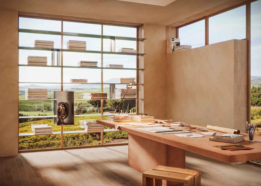
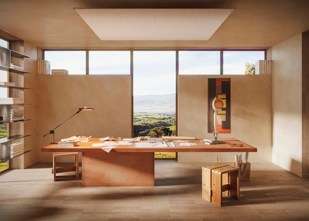
Which room did you start with?
The studio, which is practically unfurnished. Just a large central table – the absolute protagonist – that can serve various purposes, and along one side, a bookshelf that doesn’t take up too much space. I imagined fairly neutral walls with a matte finish to allow light to fill the space as much as possible and create a sort of blank canvas. Studios can become quite chaotic, crowded with objects. For the floor, I chose Crogiolo ArtCraft Argilla: the inspiration comes from those old artist studios scattered across southern Europe, with white walls and terracotta tiles everywhere. Wonderful.
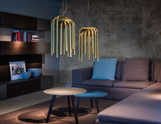
Let’s move to the next room.
The living room is a clean and essential space, but playful touches and design icons are not missing. To play with reflections, the base couldn’t be too light. At the center, the conversation pit in Vero Quercia recalls Italian design from the ’70s and ’80s. The central table, instead, is in Crogiolo Terramater Cotto. For the walls, I chose a slightly darker tone than other rooms, because I imagined a living room to be enjoyed mainly in the evening, a place to relax and listen to music.
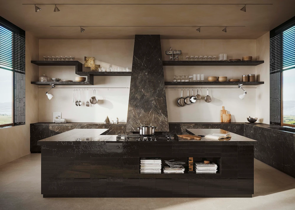
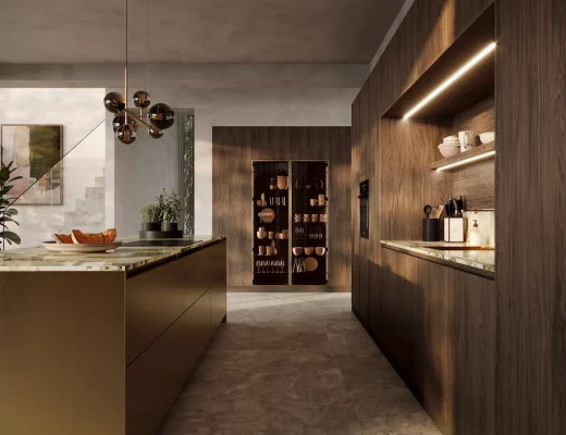
And the kitchen?
It has something traditional and original at the same time. The central hood and horseshoe-shaped counter may recall kitchens from long ago, but the black tiles from the Crogiolo Lume collection immediately transport us to a more contemporary setting. The texture of the tiles is fantastic – they convey a truly unique sense of warmth. For the floor, I chose Mystone Limestone Sand to balance the dark tones of the rest of the kitchen with a light color. For the counter and shelves, I opted for the large-format stone-effect porcelain slabs.
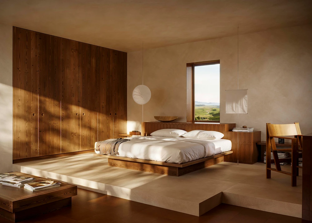
What choices did you make for the bedroom?
I incorporated Crogiolo Terramater Cotto tiles into the headboard, and then extended them to the shelf, desk, and floor. On the wall opposite the bed, there’s a bench made with the same material, which harmoniously runs through the architecture of the room. Among all the rooms in the house, this is where I used the most textured tiles, because it’s a sacred, intimate, calm space.
And the bathroom?
There’s a compact bathtub, covered in tiles, that connects smoothly to the shower. For the color, the obvious choice would have been blue. But these green rectangular tiles – part of the Crogiolo Lume collection – struck me instantly with their beauty, their extraordinary tones and shades. Looking at the landscape outside, I thought that the green, bouncing off the tiles and water, would create a truly stunning environment. The glossy finish I chose for the tiles aims to highlight light play and reflections, while also conveying a sense of hygiene and cleanliness.
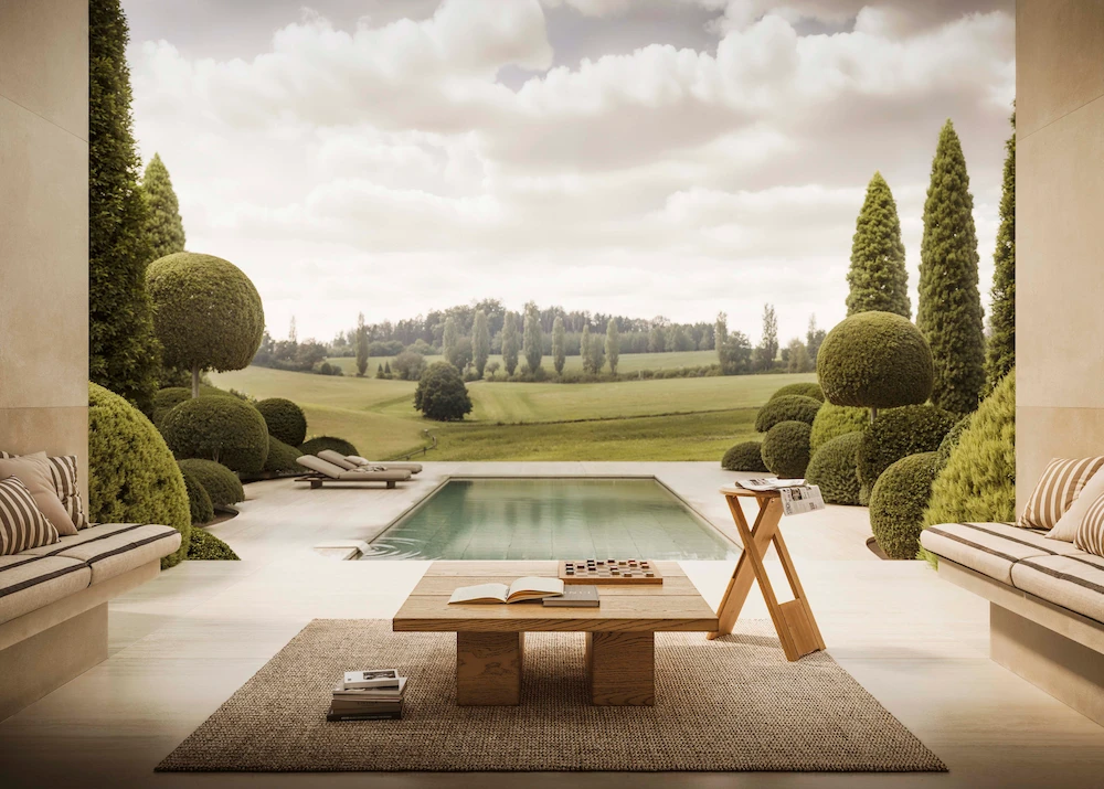
Okay, now let’s go outside.
The exterior is inspired by a series of places I visited in Italy, particularly among the hills of Tuscany. With descending steps and large open spaces, I wanted to evoke a Mediterranean atmosphere and a certain way of living. Through the pool, the house’s architecture blends with the landscape, and the boundaries between inside and outside become blurred. From the bench in Mystone Travertino20 Navona – a thick
porcelain stoneware for outdoor use – you move to the stairs and then descend to the water, all in a harmonious, seamless transition.
Who do you imagine lives in this house?
Probably an architect or an art collector. I always tend to create fictional characters when designing imagined homes. Imagination plays a crucial role when I have to transform a space – whether it really exists or only in my mind – into something tangible, connected to the human dimension. I think human design is about understanding who the people are that will inhabit a space, and making that space structured enough to ensure the comfort they desire, and flexible enough to allow them to make it their own. Spaces should take shape, adapt, and grow through the people who live in them.